
Woodland’s Colour Run
WHAT?
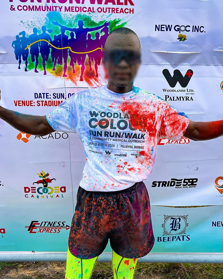
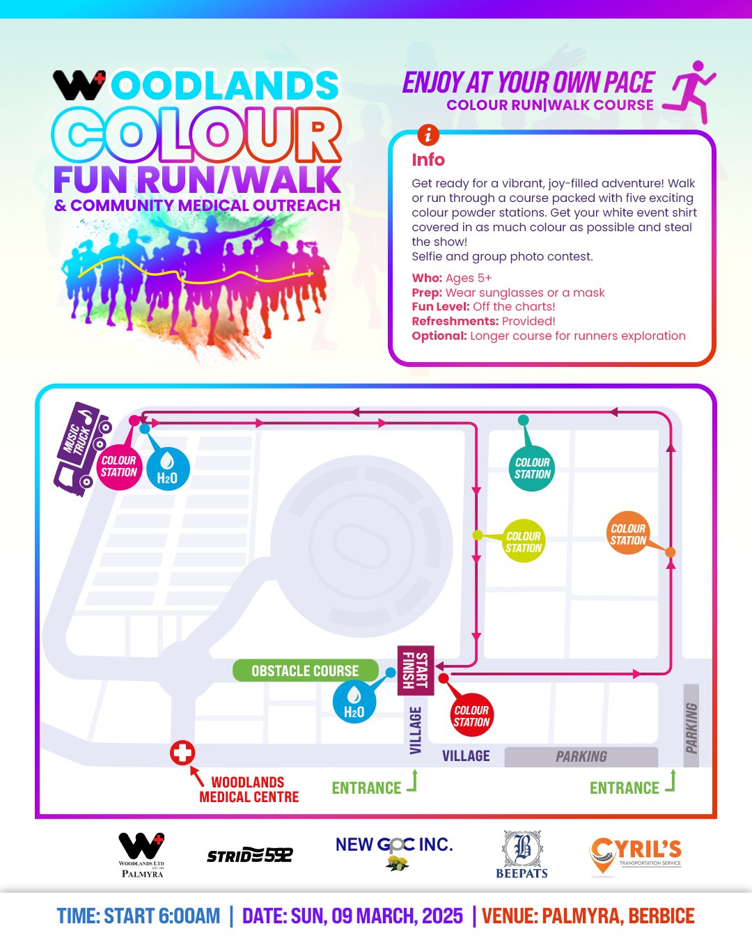
Woodland’s Colour Run was a 5K event hosted by Woodland’s Hospital, where participants were splashed with colourful powder as they crossed the finish line. The event brought together community, movement and celebration in a format inspired by the Holi festival of colour.
WHY?
A hospital-hosted community event needed branding that could hold two things at once: the trust and professionalism associated with the Woodland’s name, and the uninhibited, joyful energy of a colour run. Neither could be sacrificed for the other.
FOR WHO?
Community members of all ages and fitness levels, drawn together by the promise of a fun, colourful experience that doubled as a celebration of health and movement.
Scope of work
- Event Flyer Design
- Digital Marketing Materials
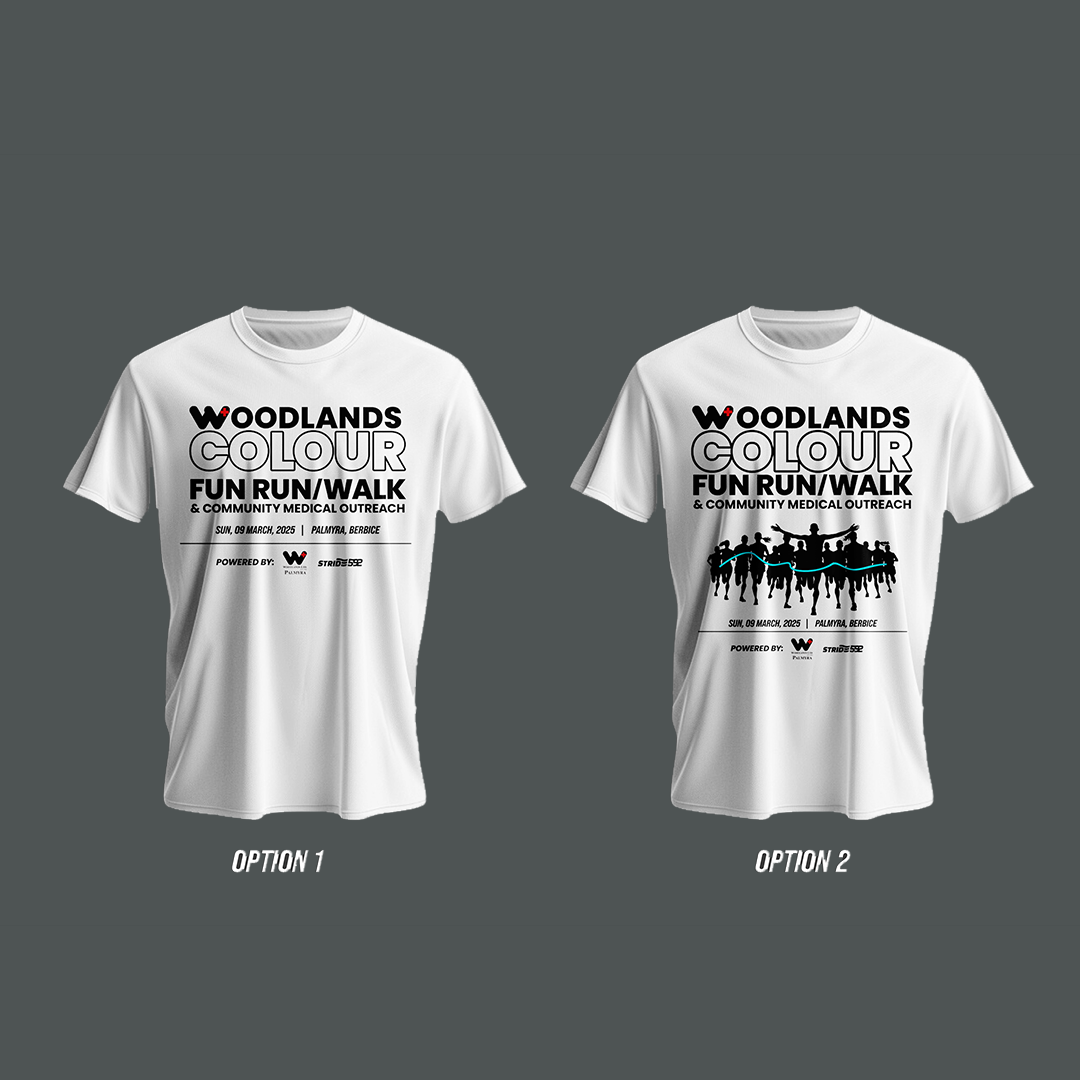
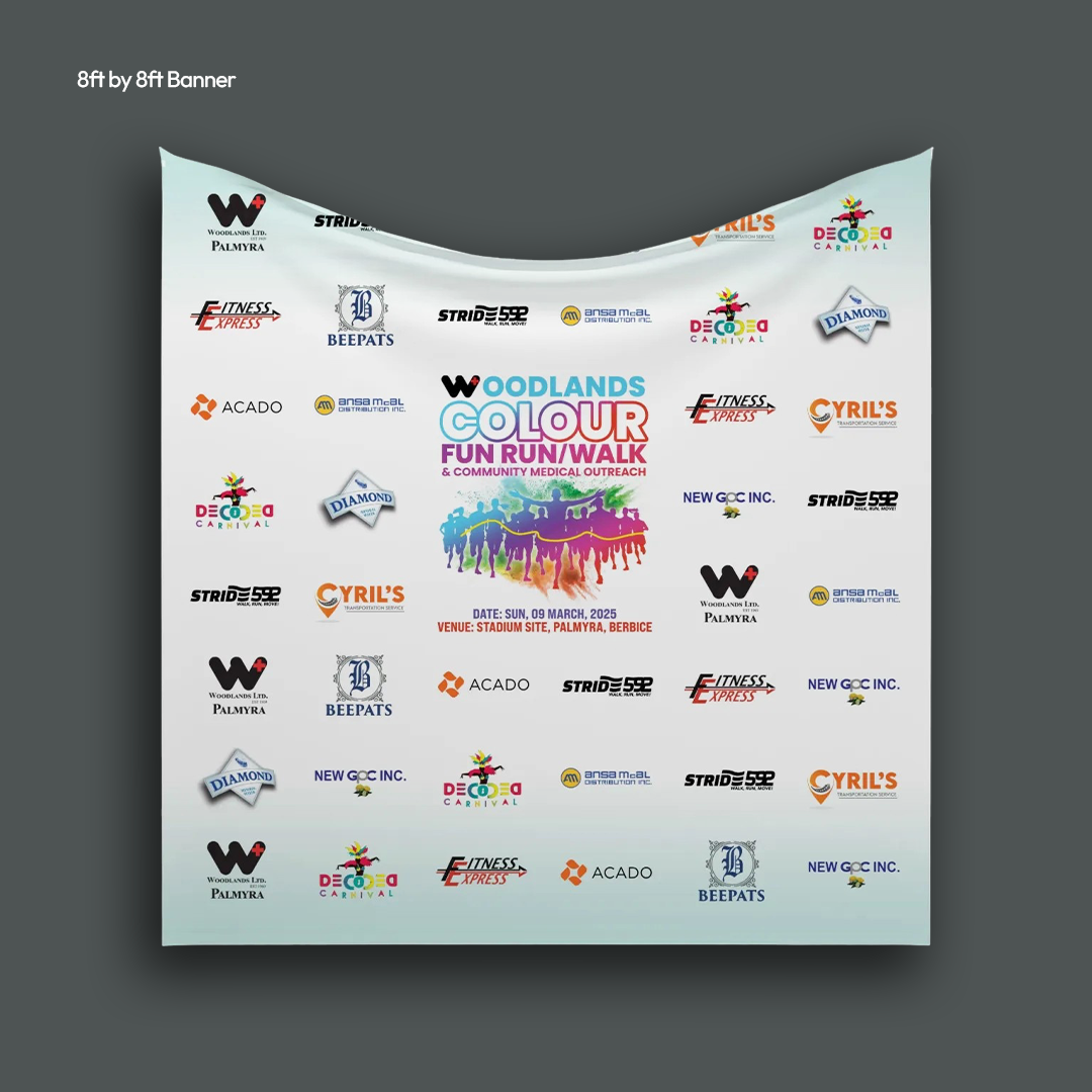
- Printed Event Materials


About the Project
Woodland’s Hospital brought the Colour Run concept to their community with a 5K event that ended in a burst of colour powder at the finish line. Holi-inspired in spirit, the event was built around pure joy, community participation and a shared celebration of movement and health.
The project covered the full range of visual materials needed to take the event from announcement to race day, across both digital and print.
The Goal
The visual challenge was specific: lead with the hospital’s established identity in teal and white, then layer in the explosive, multi-colour energy of a Holi-inspired event without the two feeling like they belonged to different brands.
The materials needed to attract participants, communicate practical information clearly and build genuine excitement across social media and print in the weeks leading up to the event.
Strategic Insights
A hospital brand carries expectations that can’t be ignored. Woodland’s is a trusted name in the community. The event branding had to honour that recognition while giving participants permission to expect something fun and out of the ordinary. Teal and white provided the credibility; the colour splashes provided the invitation.
Colour itself was the strongest promotional tool available. A colour run sells itself visually better than almost any other event format. The design work leaned into that, using powder splash elements not just as decoration but as the primary communication of what the event actually was. Someone scrolling past the flyer needed to understand the experience before they read a single word.
Community events need to feel accessible, not exclusive. The Colour Run was open to everyone regardless of age or fitness level. The visual tone had to feel welcoming and fun rather than competitive or intimidating, so that a family, a first-time runner and a seasoned participant all felt equally invited.
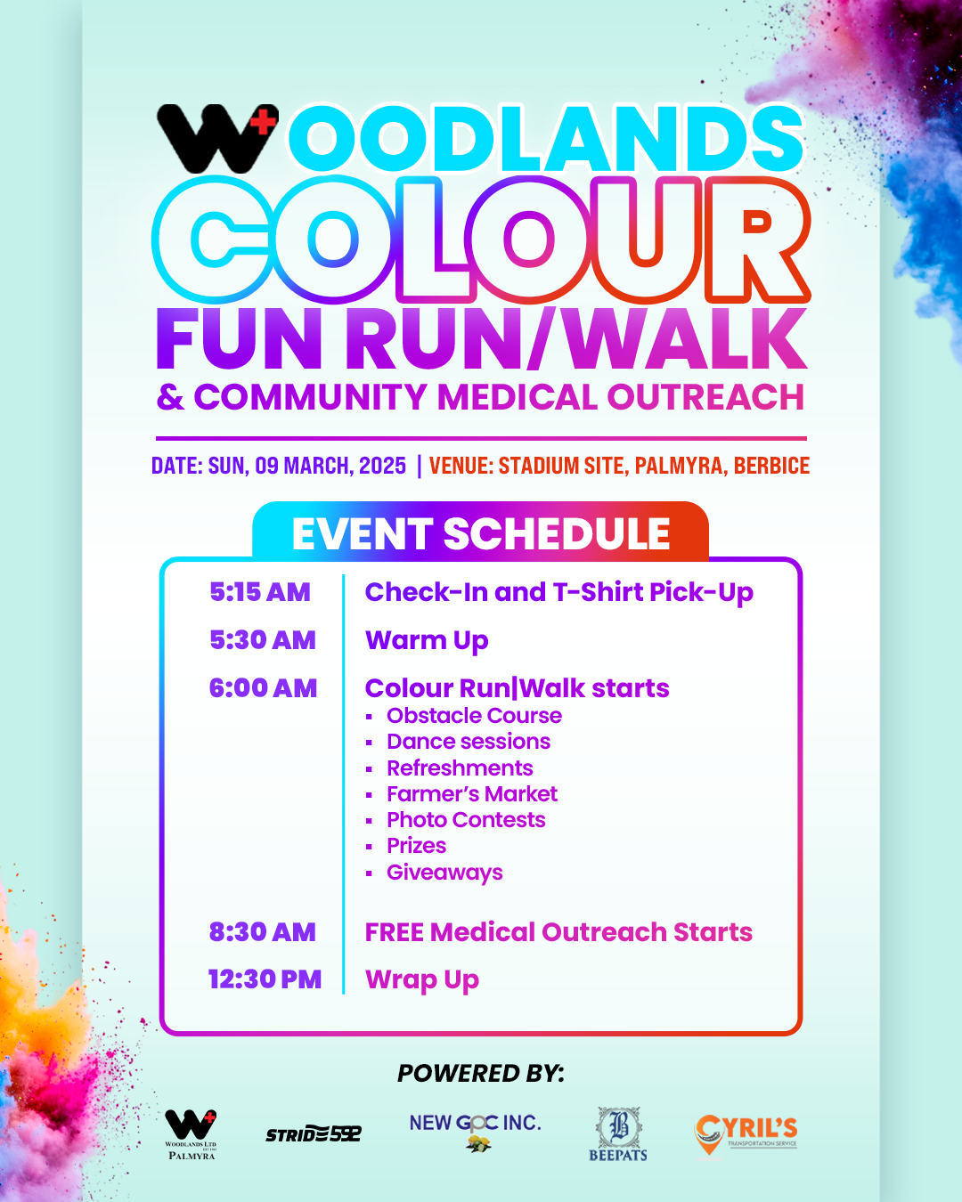
Digital Marketing Materials
Solution
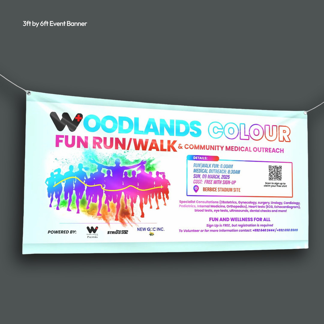
The event identity was anchored in Woodland’s Hospital’s teal and white, providing a visual thread back to the hosting organisation. Over that foundation, Holi-inspired colour splashes in pink, yellow, orange, purple and green were applied across every material, giving the branding the vibrancy and energy the event called for without losing its connection to the Woodland’s name.
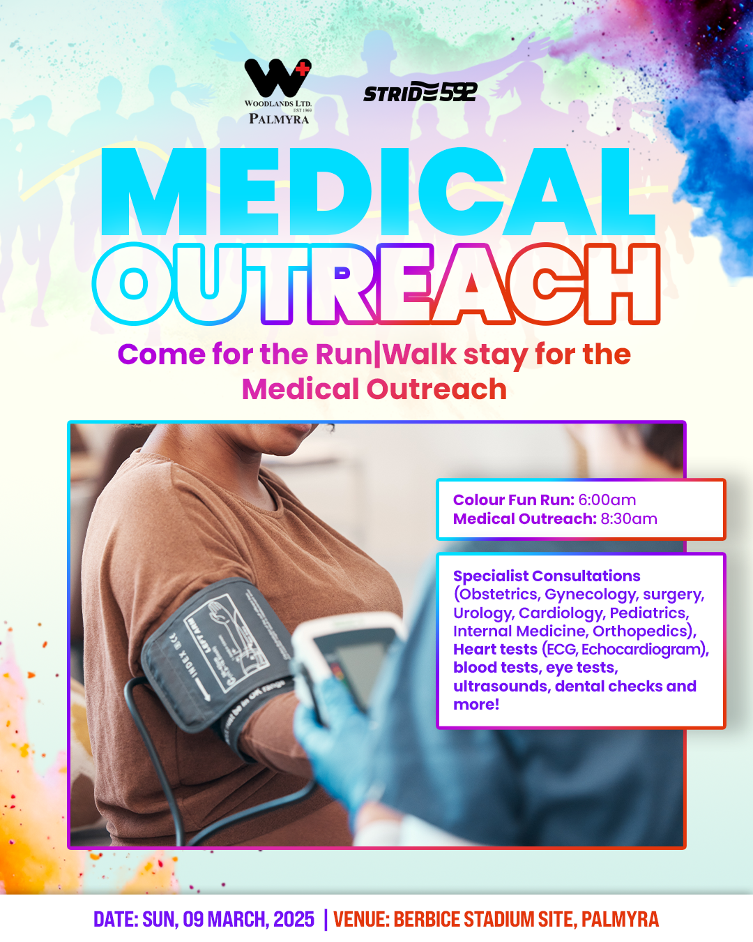
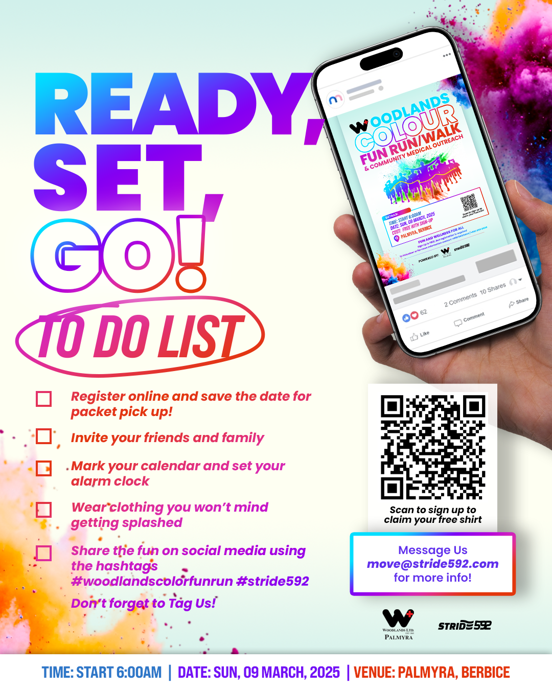
Digital marketing materials covered packet pickup, the marathon route, medical outreach, sponsorship information and the event schedule, each designed to hold the same visual energy as the main promotional flyer. Printed materials carried the identity into the physical event space, ensuring the brand looked just as considered on the ground as it did online.
The Results
Woodland’s Colour Run launched with a visual identity that balanced institutional credibility with genuine celebration. The materials worked together as a unified system from the first promotional post through to race day, giving participants a consistent brand experience that matched the joy of the event itself.
Digital Marketing Materials