

Maisha’s Bakery
WHAT?
Maisha’s Bakery is a home bakery known for its pre-order sweets and treats, launched in February 2021 on a foundation of “a little sugar, a lot of love.” As the brand’s following grew, the identity needed a refresh that felt as warm and personal as the baking itself.
WHY?
The existing identity no longer reflected where the identitiy of the business. The client wanted a mark that felt handmade, warm, and unmistakably theirs.
FOR WHO?
An established local following who already knew and loved the bakery’s treats, plus new customers discovering Maisha’s Bakery for the first time through social media and word of mouth.
Scope of work
- Logo Redesign
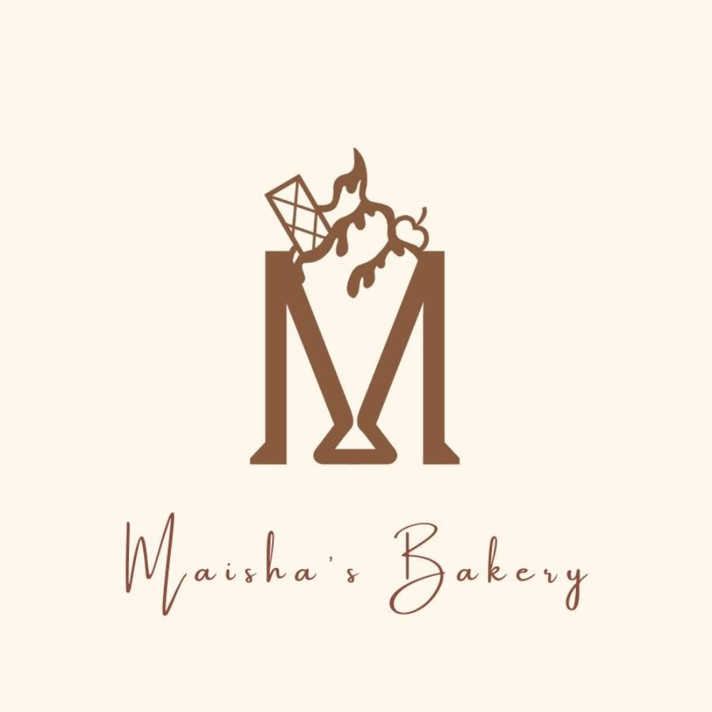
(The Original Logo)
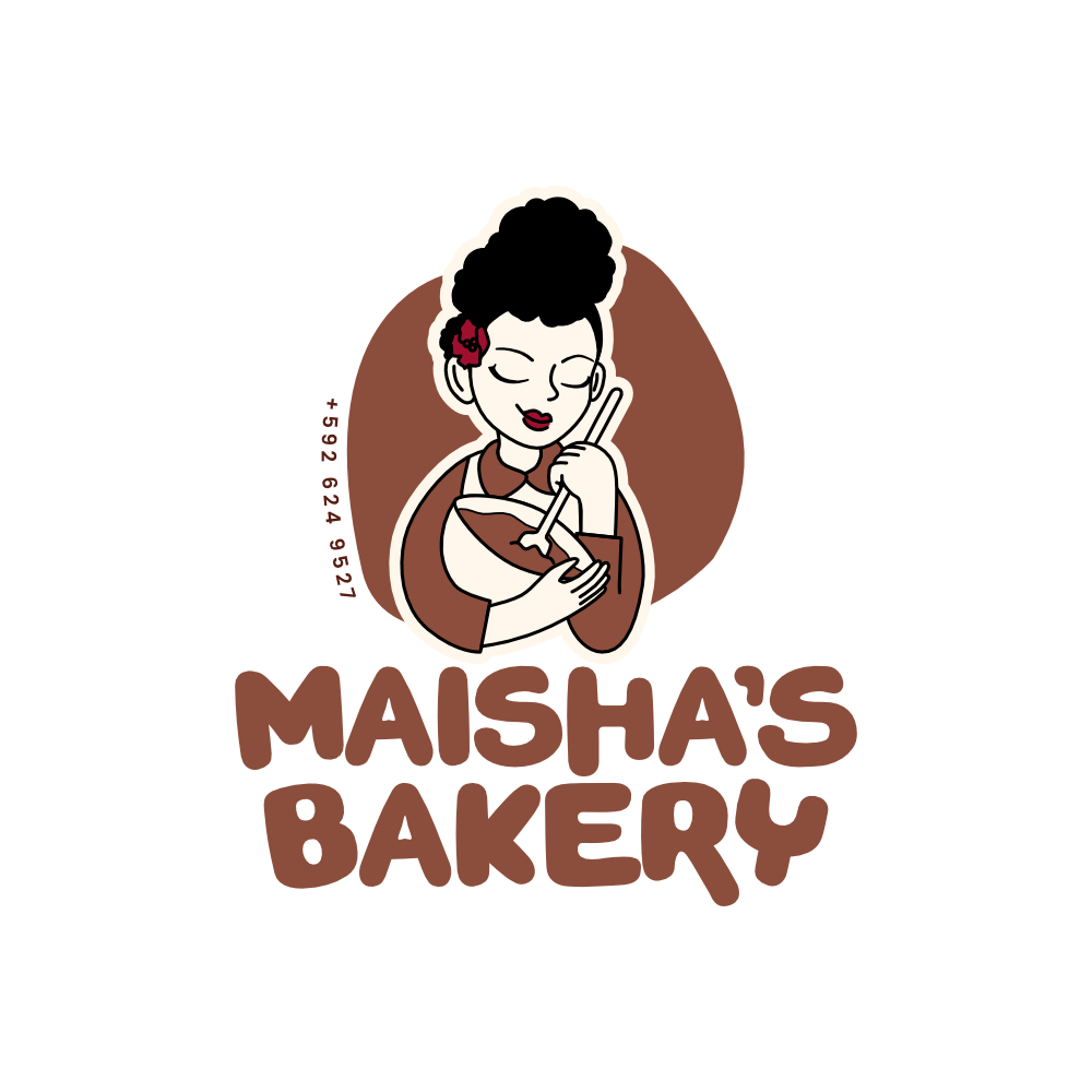
(The Redesign)
A monogram can be pretty, but it can’t tell a story. The original “M” was well-crafted, but it was interchangeable and it gave no sense of who was behind the bakery or what makes the brand special. A logo redesign was the opportunity to fix that.
A hand-drawn mascot turns a logo into a face. It makes the logo feel less like a stamp and more like a person you’d want to buy cookies from.
Small, thoughtful details build trust. Working the contact number directly into the logo mark keeps the design functional as well as decorative, useful on packaging, stickers, and social posts where a bakery’s number needs to be easy to find.
Solution
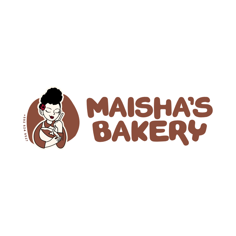
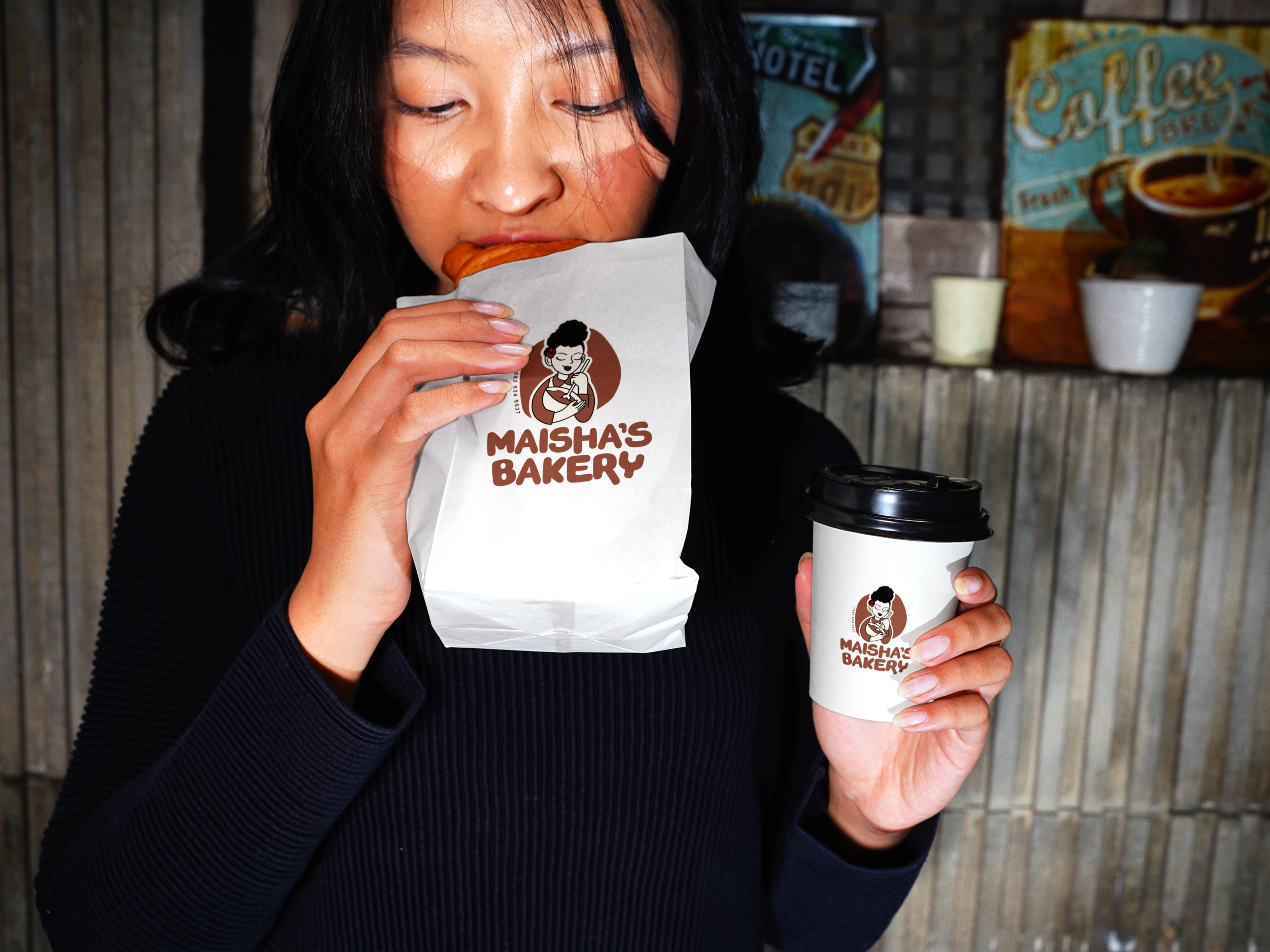
The redesigned logo centers on a hand-drawn illustrated mascot: a woman mid-stir, eyes closed in contentment, a flower tucked into her hair, rendered in the bakery’s signature warm brown and cream palette. A bold, rounded custom wordmark replaces the original script, giving “Maisha’s Bakery” a friendlier, more tactile feel that echoes the sweetness of the product itself. The contact number is worked into the mark itself, curved along the edge of the badge, keeping the logo practical as well as personal.
The Results
Maisha’s Bakery now has a logo that better introduces her brand and shows viewers the face behind it all. The new mark trades an interchangeable monogram for an illustrated identity that’s warm, personal, and instantly recognizable across packaging, pre-order posts, and social media, giving loyal customers and new ones alike a face to put with the name.