
Girls on the Move
WHAT?
Girls on the Move is a running, walking, and empowerment program for girls ages 10 to 18. Presented by Stride592, the program teaches girls how to run a 5K, build confidence, stay active, and form strong friendships. This was a brand new event built from scratch, with no existing identity to work from.
WHY?
A new program needed a visual identity that could carry it from the very first announcement. The brand had to feel energetic and youthful. It also had to feel safe and trustworthy for parents deciding whether to sign their daughters up.
FOR WHO?
Girls ages 10 to 18 looking to build confidence and fitness through running and walking, and the parents and community members deciding to support them.
Scope of work
- Event Flyer Design
- Digital Marketing Materials
- Printed Event Materials
Event Logo
About the Project
Girls on the Move launched as a program under Stride592, an organization focused on walking, running, and moving as a community. The program needed a full identity built from the ground up, from the logo down to the shirts girls would wear on training days. Every piece had to work together and speak to the same audience at the same time. That audience includes energetic young girls and the parents who need to trust the program with their daughters.
The Goal
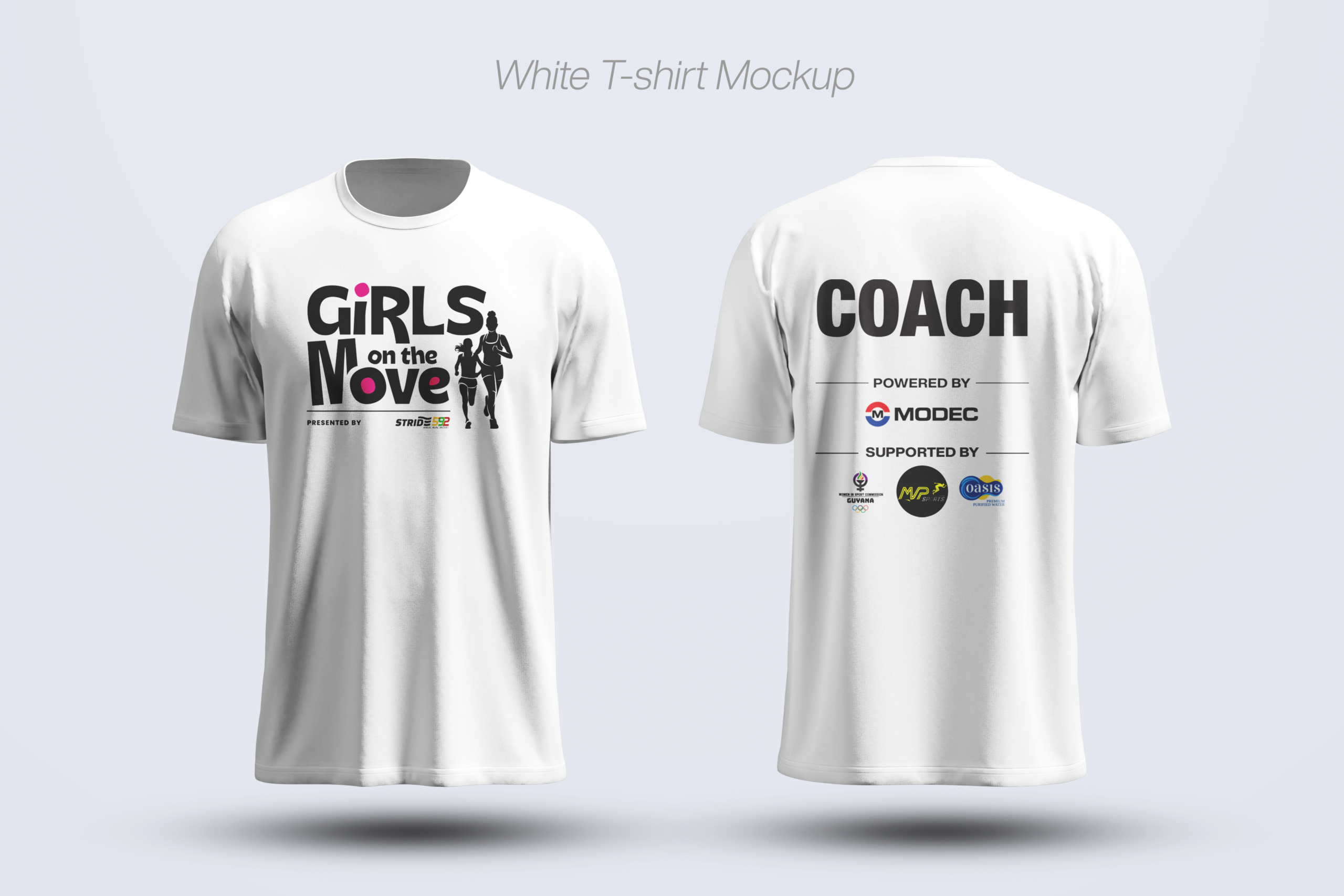
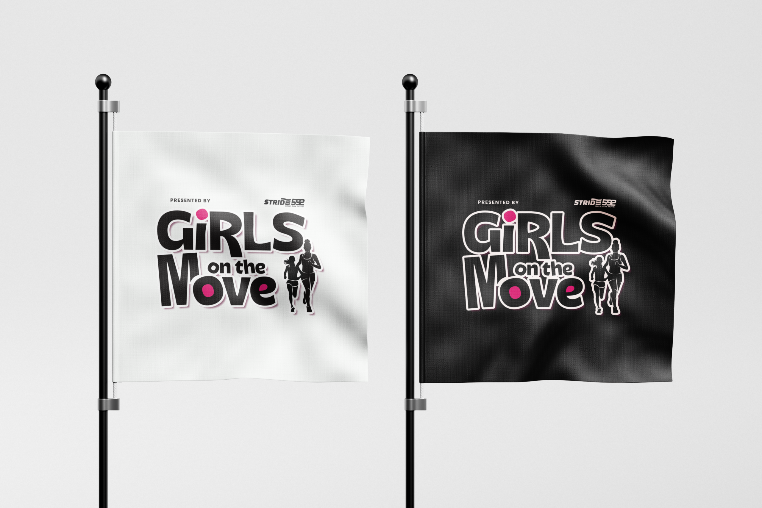
The goal was to create an identity that felt bold and playful without losing credibility. The logo needed to lead the way for everything else. A strong wordmark and a clear illustrated mark of two runners set the tone for the flyers, the banner, the shirts, and the stickers that followed. Every piece needed to work as a system, not as individual pieces built in isolation.
Strategic Insights
A new program has no visual equity to lean on. Every choice matters more when there is nothing already established. The logo had to introduce the brand and explain its energy in one glance.
Parents are part of the real audience. A program for girls still needs to earn trust from the adults signing them up. The color palette and typography needed to read as fun for the girls and credible for the parents at the same time.
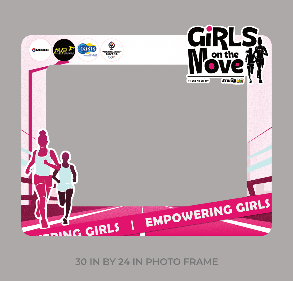
Consistency across formats builds recognition fast. A brand new event has one chance to make training days, flyers, and social posts all look like they belong to the same program. The same colors, type, and illustrated runners were carried across the flyer, banner, shirts, and stickers.
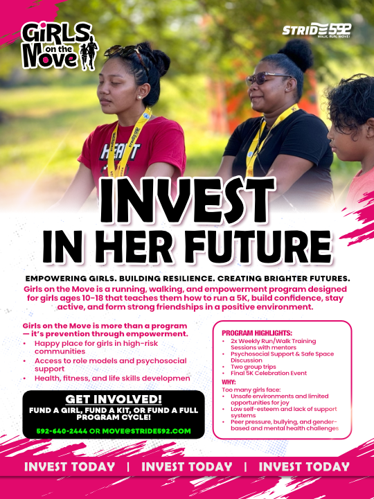
Digital Marketing Materials
Printed Assets
Solution
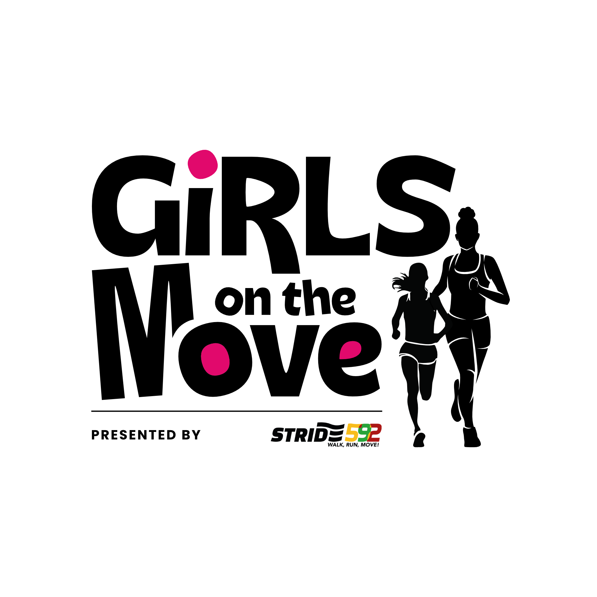
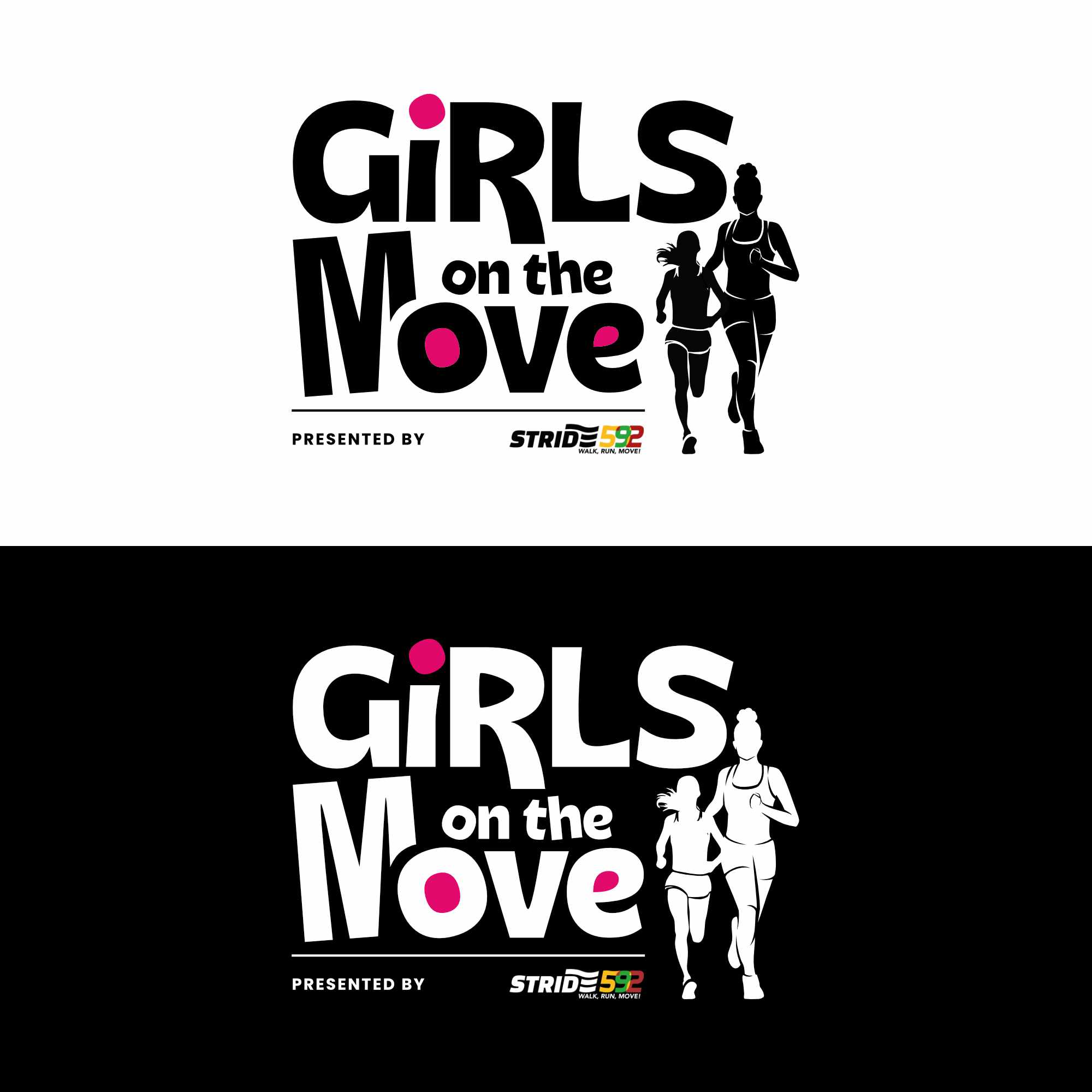
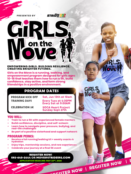
The logo combines a bold custom wordmark with an illustrated silhouette of two runners, one younger girl and one mentor figure running side by side. This pairing tells the story of mentorship built into the program before a single word of copy is read. The color palette uses black paired with a bright pink accent, giving the brand energy while keeping it clean and legible across every format.
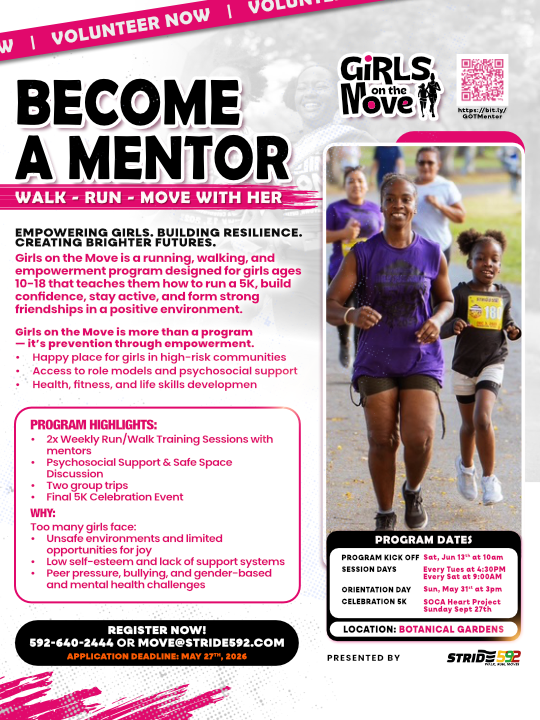
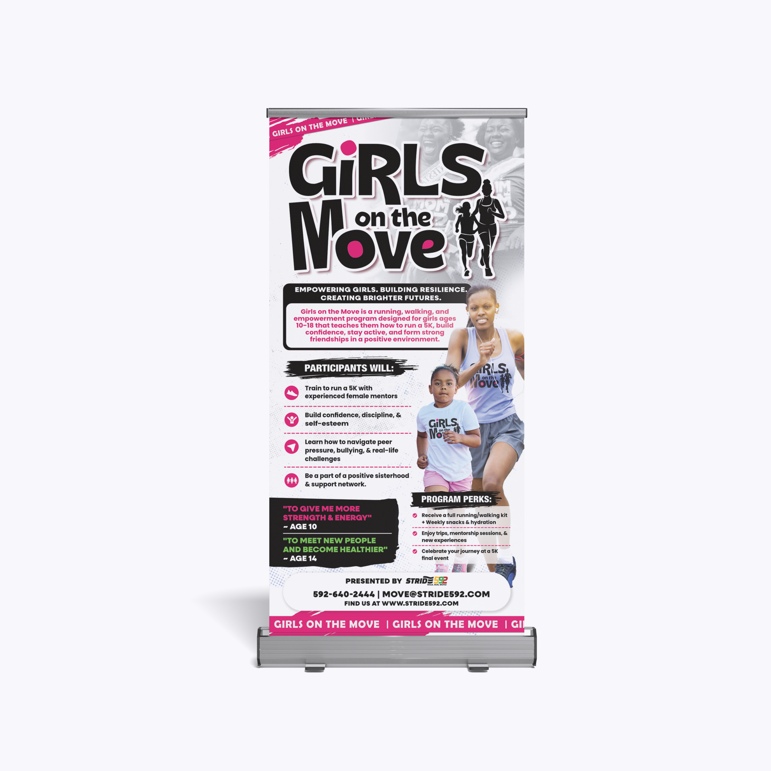
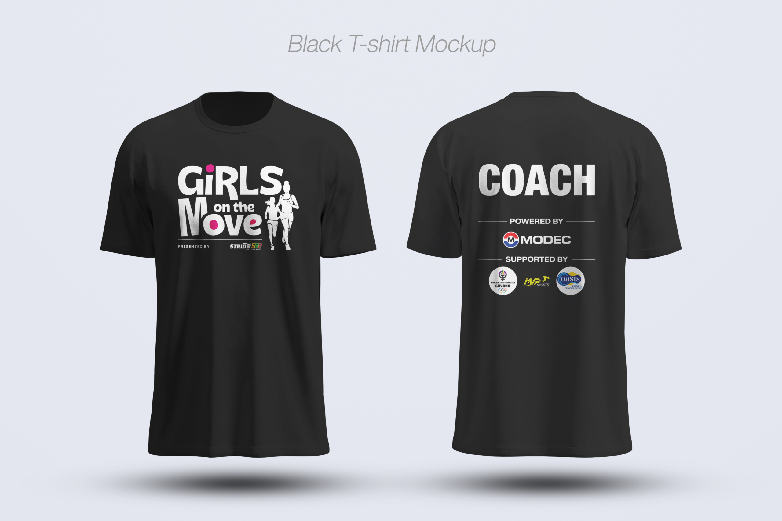
The main flyer builds directly off this system. It leads with the logo, states the program clearly, and lays out program dates, benefits, and registration details in a clear hierarchy. The banner design carries the same wordmark and runner illustration for use at the event and training days. T-shirts and stickers extend the identity into physical items the girls can wear and carry, turning the brand into something tangible and personal rather than just a logo on a page.
The Results
Girls on the Move launched with a complete identity system built entirely from scratch. The logo, flyer, banner, t-shirts, and stickers all work together to introduce the program, explain the offer, and invite registration. The brand reads as energetic and trustworthy at the same time, giving the program a strong foundation to grow its first cohort and beyond.