
Lady K’s
Lady K’s is a full-service spa in Guyana owned and operated by a single person dedicated to personalised care. The project focused on refining an existing logo and building out the foundational brand assets needed to present the business professionally and consistently.
The owner came to the project with a clear sense of who she was and who she was designing for. The main goal was to create a design that reflected the type of personal experience that clients can expect.
Scope of work
- Logo Design
- Business Card Design
The Goal
The brief was shaped by a conversation with the owner. She shared her vision, her goals and her audience, and from that a clear strategy was built. Think warm, friendly and personal. Those three qualities became the filter for every design decision that followed.
One direction was developed, refined until it was right. The deliverables included a full logo suite including a primary logo, secondary lockup, icon and supporting elements, alongside business card designs that carried the identity into print.
Logo Design
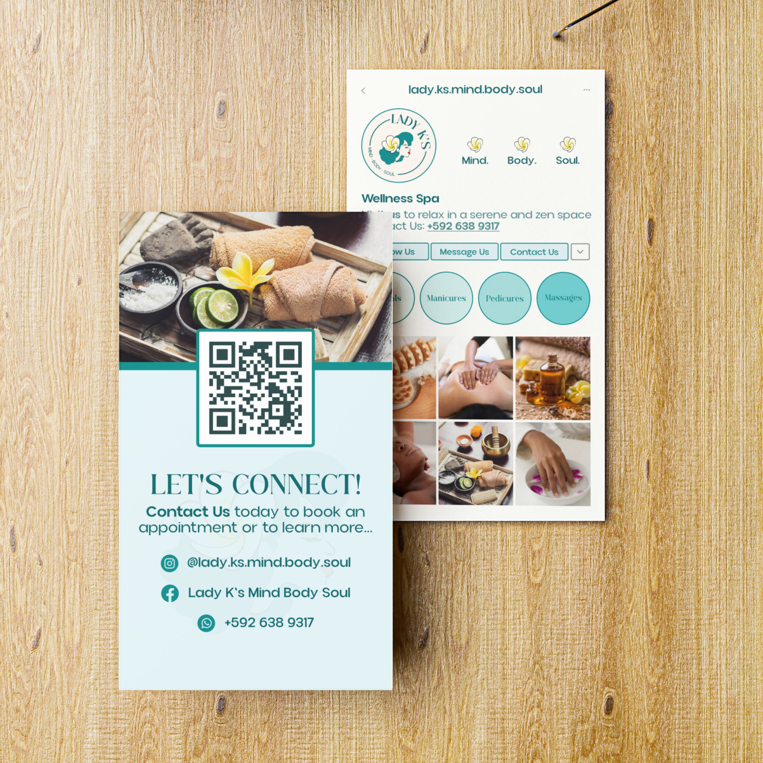
Business Card Design
Strategic Insights
Lady K’s is built on the relationship between the owner and her clients. The branding had to communicate that intimacy without sacrificing professionalism. Too corporate and it loses the warmth. Too casual and it undermines the quality of the service.
The owner’s likeness was the strongest brand asset available. An illustrated portrait of the owner built directly into the logo makes the brand immediately personal and recognisable. Clients know who they are walking in to see before they arrive.
Teal and yellow were the client’s preference, and they were the right call. Teal communicates calm and cleanliness, qualities that matter in a spa environment. Yellow brings warmth and energy without disrupting the overall sense of ease.
Solution
A full logo suite was developed around two signature elements: a flower representing the spa experience itself, and an illustrated woman reflecting the owner’s likeness. Together they create a mark that is both aesthetically considered and deeply personal.
The Results
Lady K’s relaunched with a logo suite and business card designs that set a clear tone for the brand. The identity is warm without being informal, sophisticated without being cold, and personal in a way that most spa brands never manage to be. It gives the business a foundation that reflects the care the owner puts into every single appointment.