
Camille’s Kitchen
WHAT?
Camille’s Kitchen is a Creole Guyanese restaurant bringing the flavours and feeling of home to the table. The food is rooted in tradition, made for the people who grew up eating it and for those experiencing it for the first time.
WHY?
The restaurant had a logo but nothing beyond it. No visual language, no promotional materials, no way to show up in the world yet. This project was about giving the brand its first real expression.
FOR WHO?
Everyday Guyanese who want food that tastes like home, and curious newcomers looking to experience Guyanese cuisine the way it was meant to be eaten.
Scope of work
- Promotional Flyer Design
- Brand Visual Development
About the Project
Camille’s Kitchen is a Creole Guyanese restaurant with food rooted in tradition and culture. When the project began, the brand had one asset: a logo. No visual style, no colour system, no way to communicate its personality to the public. This project focused on building the first layer of that identity, starting with the promotional materials needed to launch.
The Goal
With only a logo to work from, the goal was to establish a visual direction that could carry the weight of what the brand actually is: warm, bold and deeply rooted in Guyanese culture. The designs had to feel lively enough to stop someone mid-scroll, welcoming enough to bring them in, and authentic enough to speak to the community the restaurant was built for.
Red was the anchor. It carried the energy and boldness the brand needed without overcomplicating a starting point that still had room to grow.
Strategic Insights
A logo alone is not a brand. Camille’s Kitchen had the foundation but nothing to build from publicly. The first materials weren’t just promotional, they were identity-defining. Every design decision set a precedent for how the brand would look and feel from that point forward.
The audience already knows what they want. Guyanese customers are not looking to be convinced. They want to feel seen. The visual language had to reflect the culture directly, not a softened or genericised version of it.
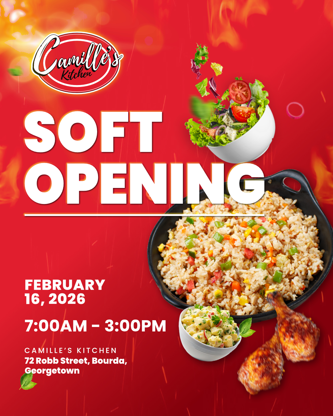
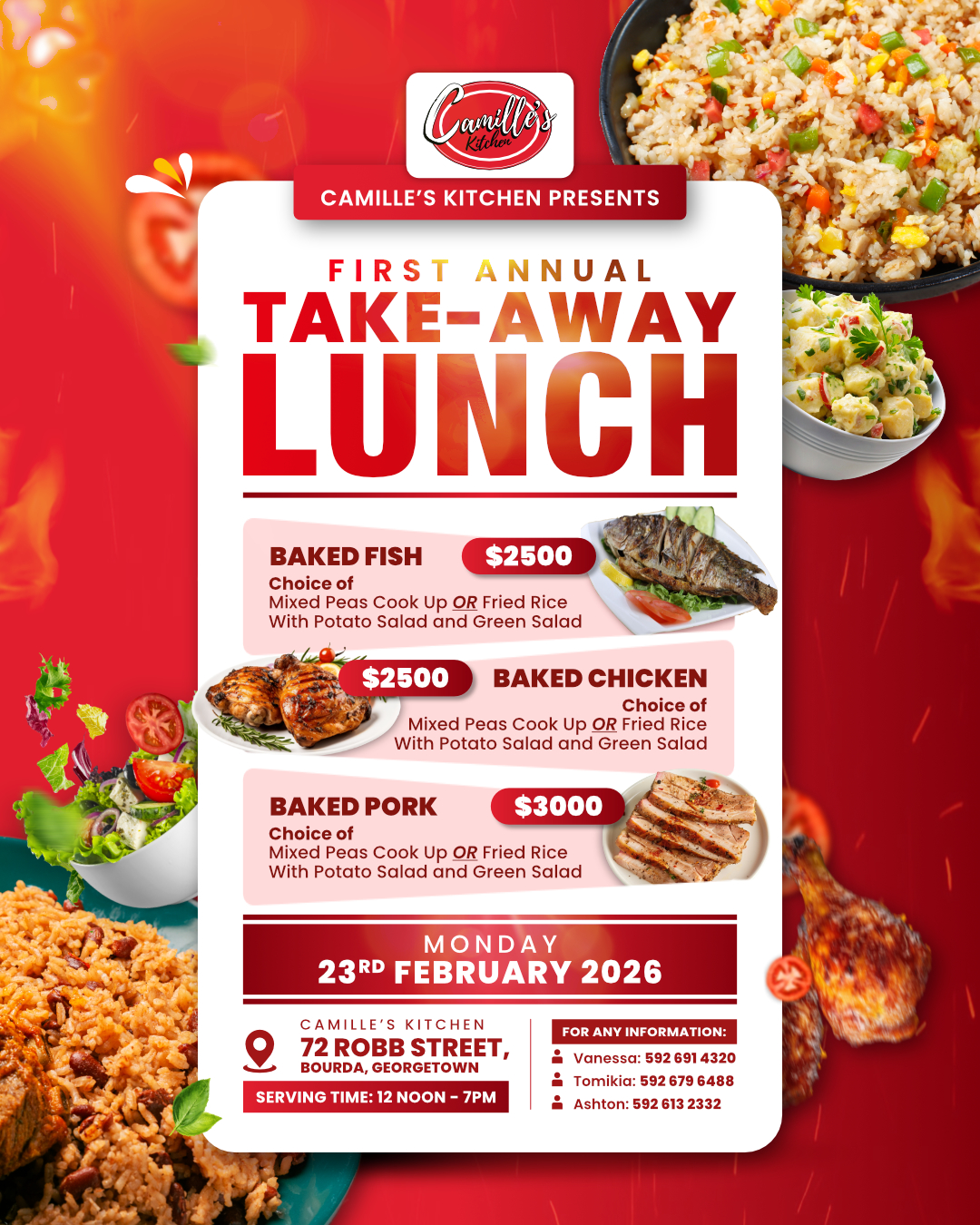
First impressions set the standard. Because these were the brand’s first public-facing materials, there was no room for generic. The soft opening flyer and takeaway lunch flyer had to immediately communicate personality, not just information.
Solution
The work started by translating the existing logo into a broader visual language built around bold red, warmth and cultural energy. Rather than designing two isolated flyers, the focus was on establishing a consistent visual tone that the brand could carry forward, so that future materials would feel like a natural continuation rather than starting from scratch each time.
Each flyer was designed to communicate clearly and quickly, with the personality of the restaurant doing as much work as the information on the page.
The Results
Camille’s Kitchen launched with a visual presence that matched the heart of the brand. The soft opening flyer and takeaway lunch flyer gave the restaurant its first public voice, and laid the groundwork for a visual identity the brand can continue to build from.