About the Project
This project focuses on refining the logo and basic branding for Lady K’s, a single-owner spa dedicated to personalized care.
The Goal
The owner shared their vision, goals, and target audience, which helped define the overall direction of the brand as warm, friendly, and sophisticated. These qualities became the foundation for all final design decisions.
The Results
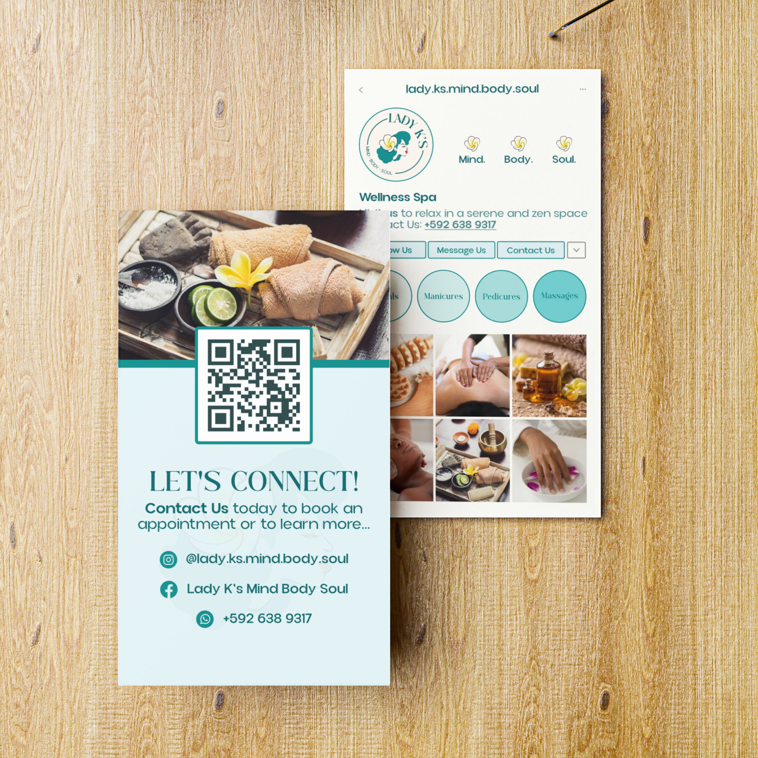
The final result was a logo suite and business card designs that set the tone for the overall brand. The teal and yellow colour palette was not only the client’s preference but also complemented the spa environment beautifully, creating a look that feels fresh and inviting.
The flower represents a signature element of the spa experience, while the illustrated woman reflects the owner’s likeness, giving the audience a familiar and relatable symbol to connect with. Together, these elements create a clean, calm aesthetic with a personal touch that helps strengthen the connection between the business and its audience.