
Reading Time: 4.5 Minutes
A Pretty Design isn’t Always a Good Design

By: Akailah Gordon
7 May, 2026
There is a version of this conversation that happens a lot, usually after a critique. A piece of work may look great, the colours are on point, the typography is clean, the layout is balanced, and the work looks objectively great; it’s appealing. But the design can still fail. Looking good and working well are not the same thing. A design can be visually polished and still be a failure. Understanding the difference between the two is one of the most important skills a young designer can have, and it is the difference between making art and creating designs.
Design Has a Job to Do
As we covered in a previous post in this series, the purpose of design communication/graphic design is to solve problems through visual communication. Every job has a goal, whether that is to inform, persuade, guide, sell, or connect. The design exists to serve that goal. When it does not, the aesthetics become irrelevant.
Dieter Rams is one of the most influential industrial designers of the 20th century, and he put it plainly in his ten principles for good design: good design is useful. Not beautiful. Not impressive. Useful. Beauty, in good design, is a byproduct of something functioning well, and not the end goal in itself. This does not mean aesthetics do not matter. Aesthetics absolutely do matter, but it is not the determining factor. A visually weak design can undermine trust, fail to attract attention, or miscommunicate a brand’s values. But aesthetics that fail to meet its purpose is just decoration, and decoration is not design; decoration is art.
 The Tropicana Lesson
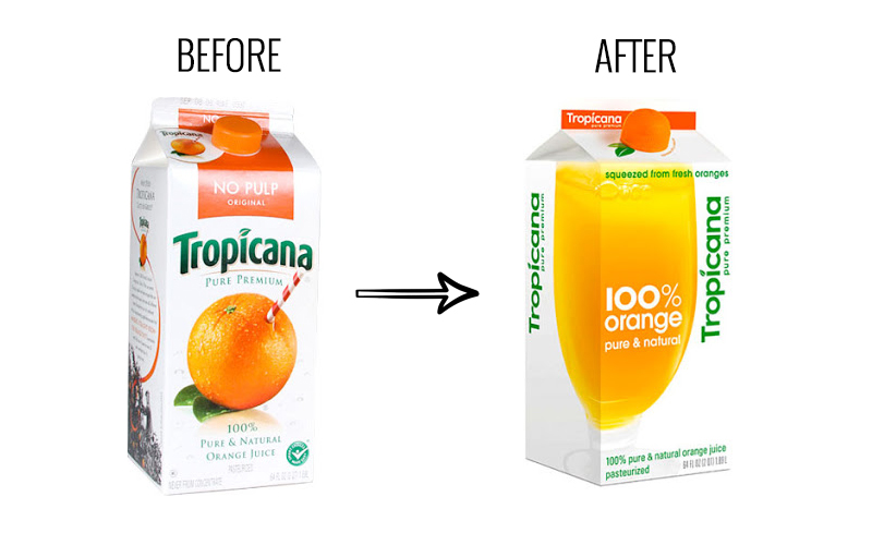
In January 2009, Tropicana, one of the most recognised juice brands in the world, launched a redesigned packaging for its flagship product, Tropicana Pure Premium. The new design was cleaner, more minimal, and more modern, replacing the iconic image of an orange with a straw in it with a simple glass of juice and a more minimal logo. By design standards, it was not a bad-looking package. It was restrained, contemporary, and well-executed. Tropicana invested $35 million in the redesign and its accompanying advertising campaign.
Within two months, sales dropped by 20%, representing approximately $30 million in losses. Competitors saw double-digit sales increases in the same period. Tropicana pulled the packaging, and the original design was restored.
What went wrong? The new design had stripped away the visual cues that loyal customers used to identify the product on a shelf. Customers could not recognise their juice. The new design, in its pursuit of a cleaner aesthetic, removed the thing the design was supposed to protect: recognition.
A pretty package that customers cannot identify on a shelf has failed at its most basic job.
The Gap Logo That Lasted Six Days
In October 2010, Gap replaced its iconic logo, a white serif wordmark inside a dark blue box that had been in place for over 20 years, with a new design featuring a plain Helvetica wordmark and a small gradient square. Gap’s VP of communications described it as “a more contemporary, modern expression”. Within 24 hours, one blog had generated 2,000 negative comments, a protest Twitter account gained 5,000 followers, and a parody logo generator went viral with nearly 14,000 submissions. ![]() Six days after launching, the company reverted to the original logo. The estimated cost of the failed rebranding was around $100 million. The new logo was a clean, technically competent piece of typography. But it communicated nothing. It had no connection to what GAP meant to its customers. The design failed because it did not solve the right problem.
Six days after launching, the company reverted to the original logo. The estimated cost of the failed rebranding was around $100 million. The new logo was a clean, technically competent piece of typography. But it communicated nothing. It had no connection to what GAP meant to its customers. The design failed because it did not solve the right problem.
What This Means for Your Work
Both of these examples come from major companies with big budgets and experienced agencies behind them. The lesson is not that even the pros get it wrong (though they do). The lesson is that no level of craft protects a design from a failure of purpose. When you are working on a brief, the questions to ask before you open any software are: Who is this for? What do they need to understand, feel, or do? What does success actually look like for this design? And then, once you have designed something: ask yourself, “Does this answer those questions?”.
A design that turns heads but confuses the audience has not done its job. A layout that wins a compliment but fails to communicate the message clearly has not done its job. A brand identity that looks modern and crisp but means nothing to the people it is trying to reach has not done its job.
Good design, when done well, becomes invisible. The viewer does not stop to admire the layout: they simply absorb the message, find what they need, or feel what the design intended them to feel.
Pretty is a Starting Point
None of this means aesthetics are unimportant. Visual quality builds credibility, attracts attention, and shapes how a message is received. A poorly executed design can undermine even the clearest communication strategy. So yes, your work should look good.
But looking good is the floor, not the ceiling. The ceiling is work that looks good and solves the problem it was created to solve, work that reaches the right people and makes them think, feel, or act in the way it was designed to. That is the standard worth working toward.

Starting a Business: A Beginner’s Guide to Branding
Starting a business is exciting, and possibly overwhelming. One of the most important things you need to focus on is branding. Your brand isn’t just about having a nice-looking logo; it’s about creating an identity that connects with your audience and makes...
How to Build a Community
Community Is the Foundation of a Great Brand Trust, reliability, and a shared purpose are the building blocks of any lasting community. They're also the same foundations that underpin the success and longevity of a great brand. Think of that one business...
200 View Jail: Why No One is Buying
The Difference Between Advertising and Marketing (And Why It Matters for Small Businesses) If people are seeing your product but not buying it, you have a marketing issue. If no one is seeing your product, you have an advertising issue. Advertising gets...
Guide to Naming Your Brand or Business
When starting a new business or rebranding an existing one, choosing the right name is a crucial step that can significantly impact the success of your brand. Your brand name is a fundamental part of your brand identity. It’s how your audience...